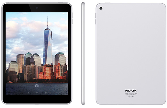
Nokia nowadays is refocussing its efforts towards other devices, mainly tablets, and I have to say does a good job at it. The N1 tablet made by Nokia and running on Android, is the most strikingly beautiful tablet that I have seen in a while on the Android devices front. But to address one issue quickly out of the way, yes, it does look like the iPad Mini down to the speaker’s grille and the colour of the metal. It is in every way an iPad Mini clone, but it’s the best one so far. This goes to show you that the design works and appeals, so why not stick with it? Nokia makes no mystery about this and doesn’t pretend to rain when it actually doesn’t, therefore there’s no denial from Nokia’s part that the N1 tablet looks like the Apple tablet. And you know what? If the OS is without lags, crashes or freezes and inhabits a beautiful yet familiar design then where’s the harm in that?
The N1 unveiled at MWC 2015 is unbelievably sleek and sexy, so if you’re into Android but looking for something different than look no further. You should definitely consider buying one like this. Easy on the eyes and ever alluring, the device is made of aluminium (of course) and weighs a measly 318g but this is not even the best part about it. No, the best part is that at €249 it makes it an excellent buy and well worth it. If the device comes to the US at a $249 price tag than this can’t possibly go wrong. Straight out of China Nokia comes forth with the kind of gadget that brand fans have been longing for and if this rolls out into Europe it might make a believer out of me. Although Nokia faces hard times losing the mobile division, it still retains some of that old glory demonstrated with the release of such devices. An Android tablet never looked so good.

The minimalism of iPad Mini works well too for an Android tablet
But what sets it apart from iPad Mini, something merely than the OS? Well, an Android that hasn’t been altered much, only improved with a gorgeous user interface, the Nokia Z Launcher. And it gets along really well with the Android 5.0 Lollipop version running the show. The Nokia Z Launcher is a well-made interface packed with features aimed at efficiency and governed by the principle of simplicity. One interface has a four-by-three apps grid on the home screen which adapts to you depending on what apps you use and when. Specifically if you’re focused on productivity, and check emails and news, then the home screen will push the related apps forward instead of others. But if say, you’re more into entertainment, watching streaming services than streaming apps will pop-up on your screen.
The second interface lets you draw letters on the home screen to search the apps you want. Write one letter or the whole name if you like, and the app will appear. Also available when searching contacts. Other highlights that the Nokia N1 comes with are two stereo speakers found on the bottom of the device that offer a noteworthy sound experience, a Type-C USB connector that allows you to charge the tablet faster but also transfer your files from the device to other devices. Leaving the more than familiar design philosophy aside, this Android slate has a 7.9 inch 2048 x 1536 resolution IPS LED display that adorns the front, and a 6.9 mm thickness that is thinner than the iPad Mini. The internals of the N1 are a 64-bit Intel Atom processor of 2.3 Ghz, 2 GB RAM, 32 GB internal memory and a 5,300 mAh battery. Not to mention the 8 megapixel main shooter and the 5 megapixel front-facing camera. But why did I mention that you can’t buy it? Because is not available yet except in China but make a wish so that it rolls out further
